The origins of the Neo brand & logo
This September, Neo Consulting turns three years old! Neo was founded with a mission to ensure long standing partnerships, providing efficient and sustainable outcomes for our clients. Thank you to those that have partnered and grown with us so far on this journey.
 To mark the three-year anniversary, we’re sharing the story of how the Neo brand and logo was created. We very much wanted a logo and design that would represent our company values; a dynamic organisation with pragmatic solutions and inclusive leadership. Interpreting those values into a tangible logo and brand design is not always a straightforward process, so there were a series of workshops arranged to hone in on a variety of ideas.
As well as requiring the logo to underpin Neo’s company values, it was also important to ensure it represented what we do; electrical engineering. During our brand workshops, we first brainstormed our name – Neo. We had several names put forward as starting points to work from. One thing that we were quite certain on from the start was that we didn’t want a company name that involved a person’s name or an acronym.
While reviewing the suggested brainstormed names, one of the suggestions sidetracked the team into talking about the film ‘The Matrix’, and more specifically the main characters from the film. Neo is the main character, and when we searched the meaning behind the word ‘neo’, we discovered it meant ‘new’. It was a serendipitous moment for a few reasons. We were forming a new company; we were trying something new; and it was a new beginning for us. The name worked well, and so the brand Neo Consulting was born.
 Having decided on the company name, we engaged the services of Dave Sauvage and his team, a boutique graphic design consultancy in Auckland. Dave was fantastic at taking the brief and vision, and creating a new company logo from scratch. The brief was kept relatively flexible and broad, with the underpinning concepts of electrical engineering and partnership to be reflected in the final design.
Dave says, “I researched a wide range of electrical equipment that electrical engineers use in their profession, and one of the images I came across was a cross section of a very large industrial cable depicting the 3 rings. I felt a stylised version of this would work well for Neo’s logo.”
When it came to the three rings represented in the Neo logo, initially our engineering tendency was leaning more towards ‘real world accuracy’ by keeping them in the traditional electrical engineering colours of three-phase; red, white and blue. However, upon seeing the traditional colours represented, we all agreed that a more creative colour palette reinforced the company position of providing creative solutions for clients.
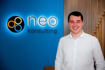
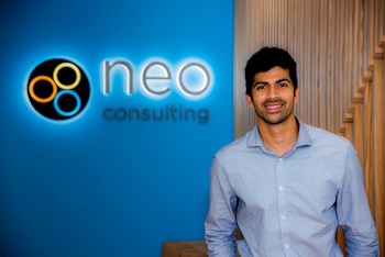
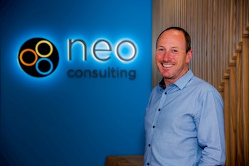
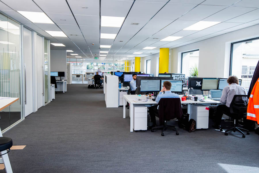
 The resulting Neo Consulting logo is used in a variety of ways throughout the company. There are three small meeting rooms in the office, each hosting a feature wall painted in one of the Neo logo colours. Additionally, the pillars down one side of the Neo office are all painted in the same yellow found in the logo, to add some brightness and life. Utilising the company logo colours and ethos is threaded into the office throughout, just as the company values are underpinned in everything we do.
We are proud that the values symbolised in the Neo logo were designed by the Neo team. They are important to the ongoing partnerships that have been grown and cultivated over the last three-years. You can be assured that they remain the fundamentals of who we are and how we’ll continue to partner with clients going forward.
![]()